Marketing

All yourmarketingin one place

Your brand, your website, your ads and your content, all made by the same team. No one else to hire.

One point of contactYou don’t juggle three different agencies: design, code, branding and content live in one conversation.

Sound familiar?

Hiring someone different for every task is exhausting, and it shows.

  • I have a designer, someone running the ads and someone else who built the website… and nobody talks to each other.

  • Every time I need something new, I have to find and hire someone else.

  • My logo says one thing, my social media says another and my website says something else.

  • I pay for ads, but the page people land on doesn’t convince them.

One team

Your brand, your pages, your ads and your content all come from the same place.

We split it into two lines that work together: ARCANA builds the brand and ACE puts it out there. What one designs is what the other uses.

  • Branding and identity

    ARCANA

    What your brand is before it says a word. Concept, logo, visual system and guidelines, so it looks the same everywhere.

    • RebrandingWe refresh your brand without losing what you’ve already built: logo, colors, tone and every piece where it appears.
    • Brand designIdentity, logos, visual systems and style guides so your company looks, and feels, solid.
    • Brand guidelinesEverything documented: logo, versions, colors, typefaces and usage, so anyone can apply the brand the right way.
    • Characters and packagingMascots, characters and packaging that take the identity to products, launches and merchandise.
    See brands
  • Content and campaigns

    ACE

    The card that puts your brand in play: content that keeps it alive, Google and Meta ads, and pages built to get you messages.

    • Content creationDigital content, social media and video pieces that keep your brand alive and connected to its audience.
    • Meta AdsAds on Facebook, Instagram, Messenger and WhatsApp using the content we produce ourselves, built for your audience and so they message you directly.
    • Google AdsCampaigns that show up when people are searching for you, with the landing page built by the same team.
    • Landing pagesFast pages that look great on a phone and are built to turn visitors into customers.
    See case studies

ARCANA · Branding and identity

Brands we design.

Not just a logo: the concept, the construction, the palette, the typography and how it applies to every piece. It all goes into one manual so the brand looks the same everywhere.

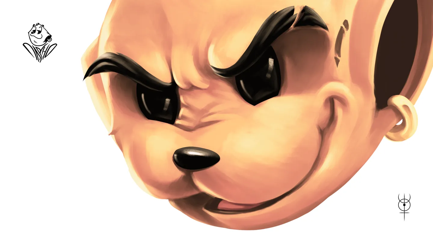
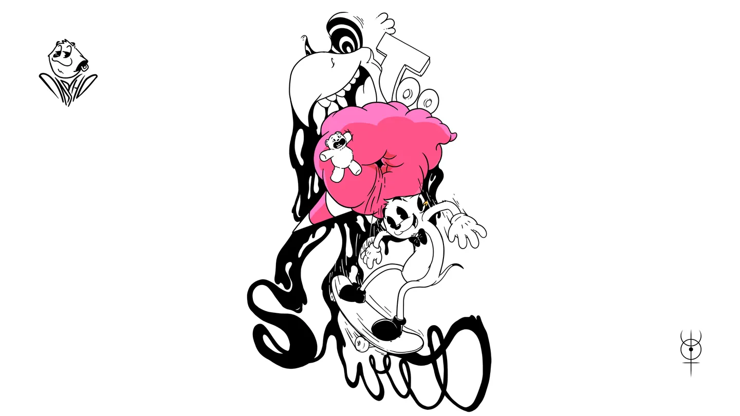
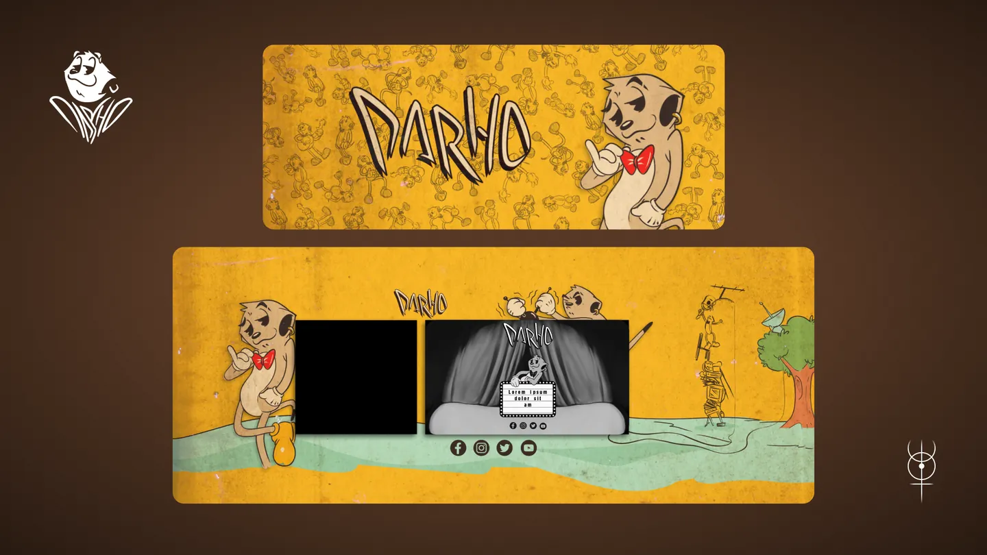
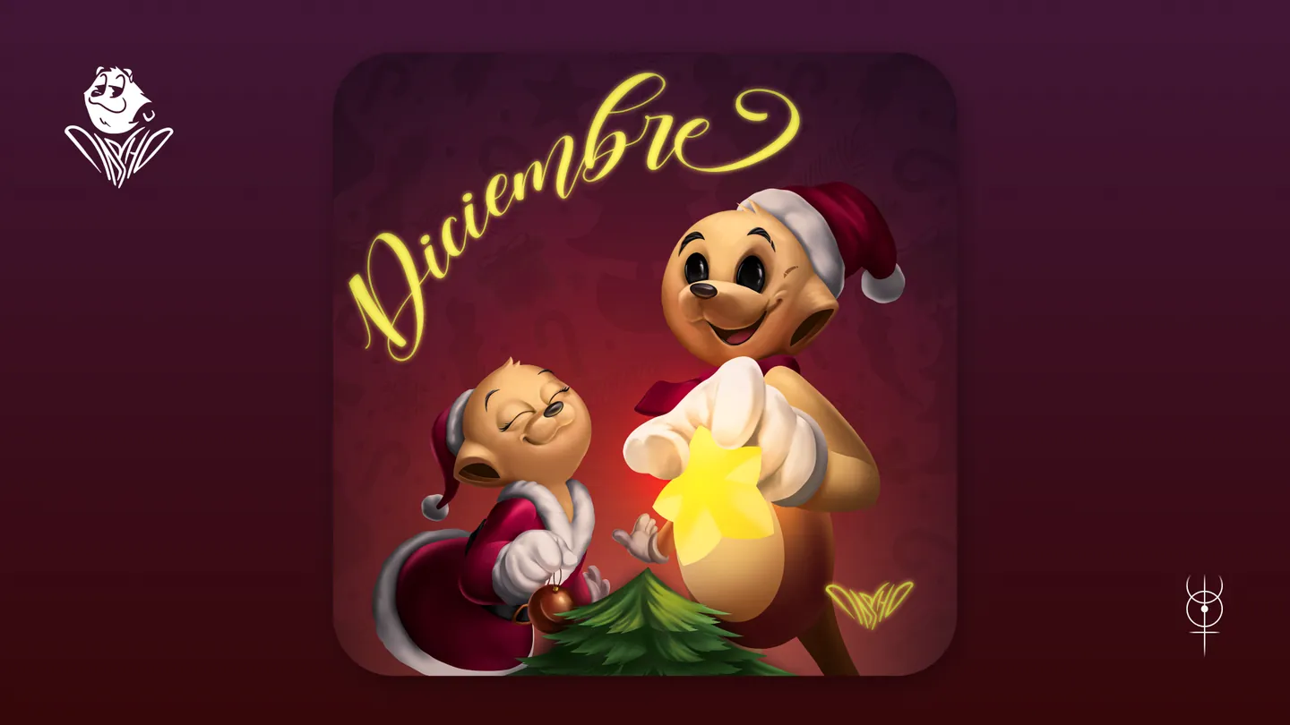
Character and identity for DARHO, artist

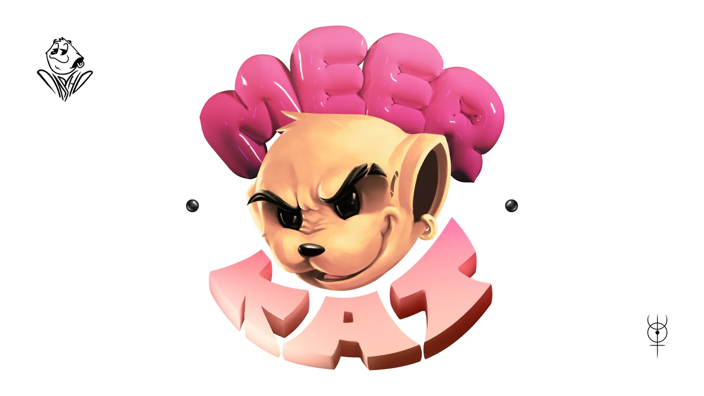
Meerkat

A character made of love

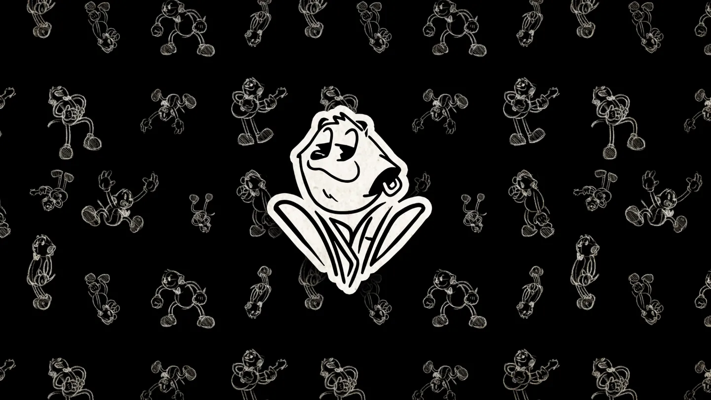
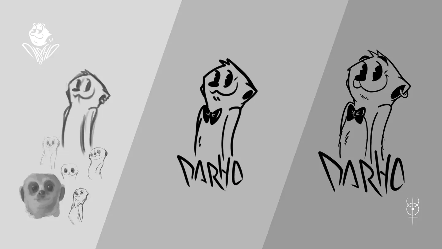
Meerkat was born as part of the visual identity built for DARHO, a Colombian artist, with the goal of creating an iconic, recognizable character that could become an extension of the artist's personality, music and brand universe. The choice of a meerkat comes from the artist's personal connection with this animal and, above all, from a strong bond with family. From there, love became the central concept of the project and the common thread of the whole visual system.

Read the full concept

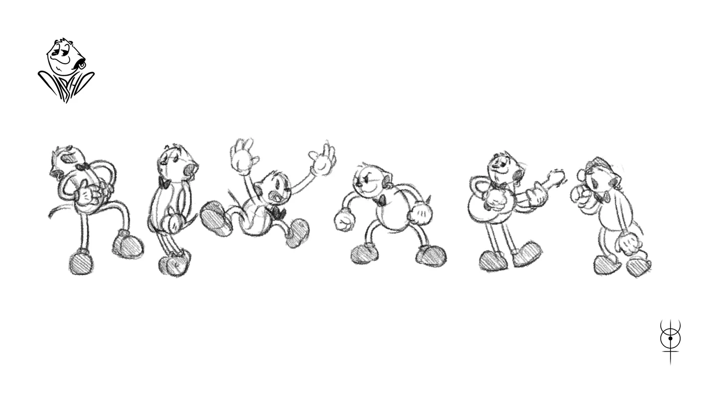
The character was conceived as DARHO's representation inside an illustrated universe: a figure able to accompany music releases, content and merchandise, much like classic characters outgrew their original format to become recognizable symbols on their own. Its art direction draws on American animation from the early decades of the 20th century, reinterpreting its proportions, gestures and visual language from a contemporary perspective. References such as the earliest versions of Mickey Mouse, and the revival of this aesthetic through projects like Cuphead, were key to defining its graphic personality.

The project also includes DARHO's identity, through graffiti-inspired lettering and different brand compositions. In the main version, Meerkat and the DARHO name come together to subtly form the silhouette of a heart, visually summing up the concept the whole project started from: love.

From this system, Meerkat has been adapted to the artist's different styles, formats and needs, showing that the character can evolve without losing its identity and becoming a recognizable element of DARHO's visual universe. The result is an identity that connects music, illustration and branding around a single concept, turning a character into a communication tool that represents the artist beyond a logo.

Palette

  • #000000
  • #FFFFFF
  • #DB6A88
  • #FBD7B8
  • #E2A930

Typography

Graffiti-inspired lettering

  • Character
  • Sketches and poses
  • DARHO lettering
  • Brand compositions
  • Graphic pattern
  • Digital pieces
Meerkat on the character pattern

Law firm

Legal Koru

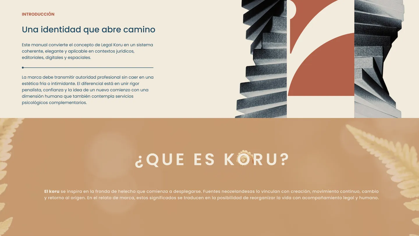
An identity that opens the way

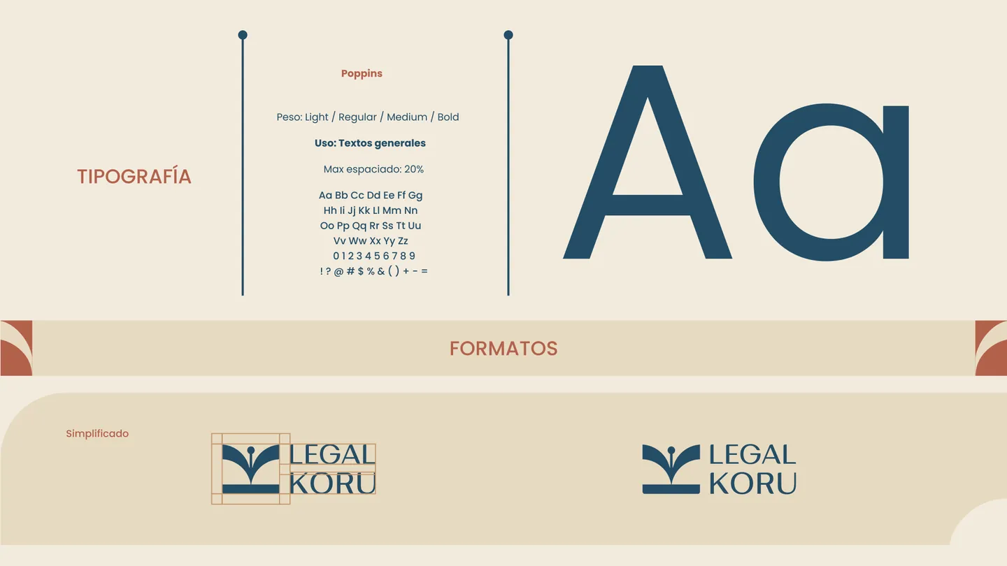
Legal Koru is an identity built to represent a closer, clearer and more human way of understanding legal services. The project starts from the need to convey professionalism and trust without relying on the traditional, rigid or overly solemn codes of the legal sector.

Read the full concept

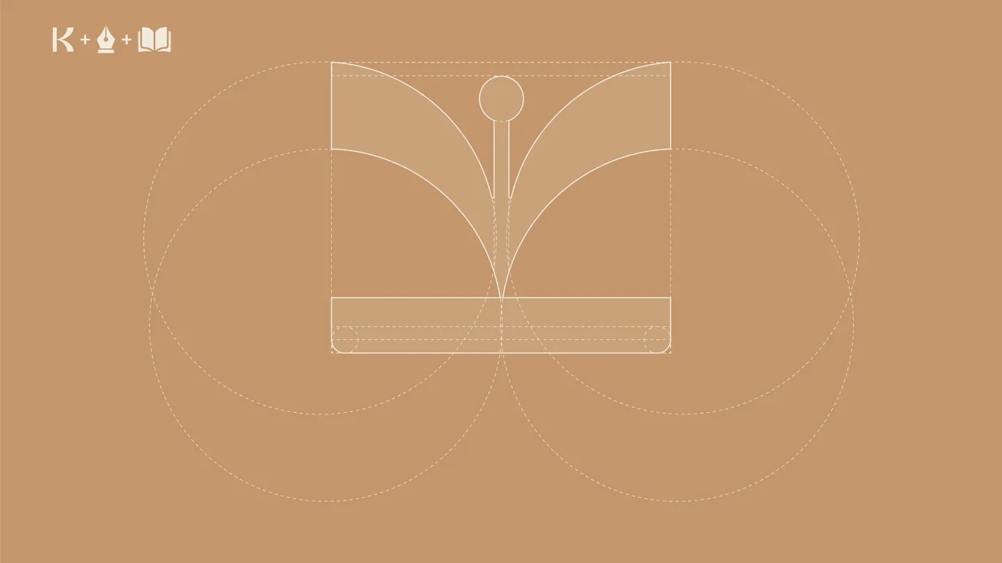
The visual identity balances solidity, empathy and modernity, using a clean, sophisticated language that communicates authority without creating distance. The symbol is the core of the system, adding recognition and reinforcing a personality that seeks to accompany, guide and reassure clients through processes that can often feel complex.

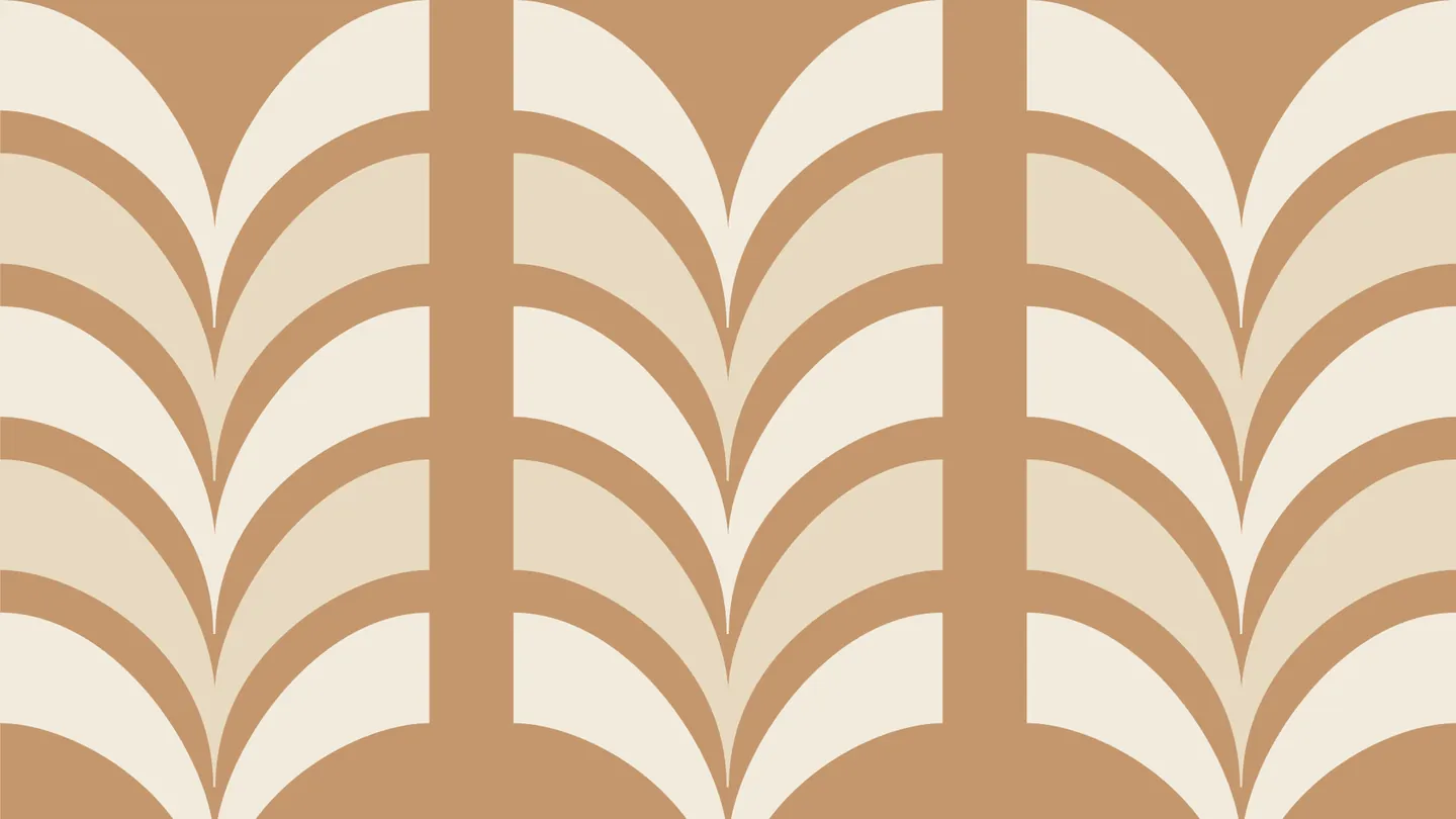
The typography, color palette and visual treatment were developed to build a brand that is professional yet approachable, able to work consistently in both corporate and digital settings. The result is a contemporary, flexible identity that positions Legal Koru as a trustworthy, approachable law brand, ready to build more transparent relationships with its clients.

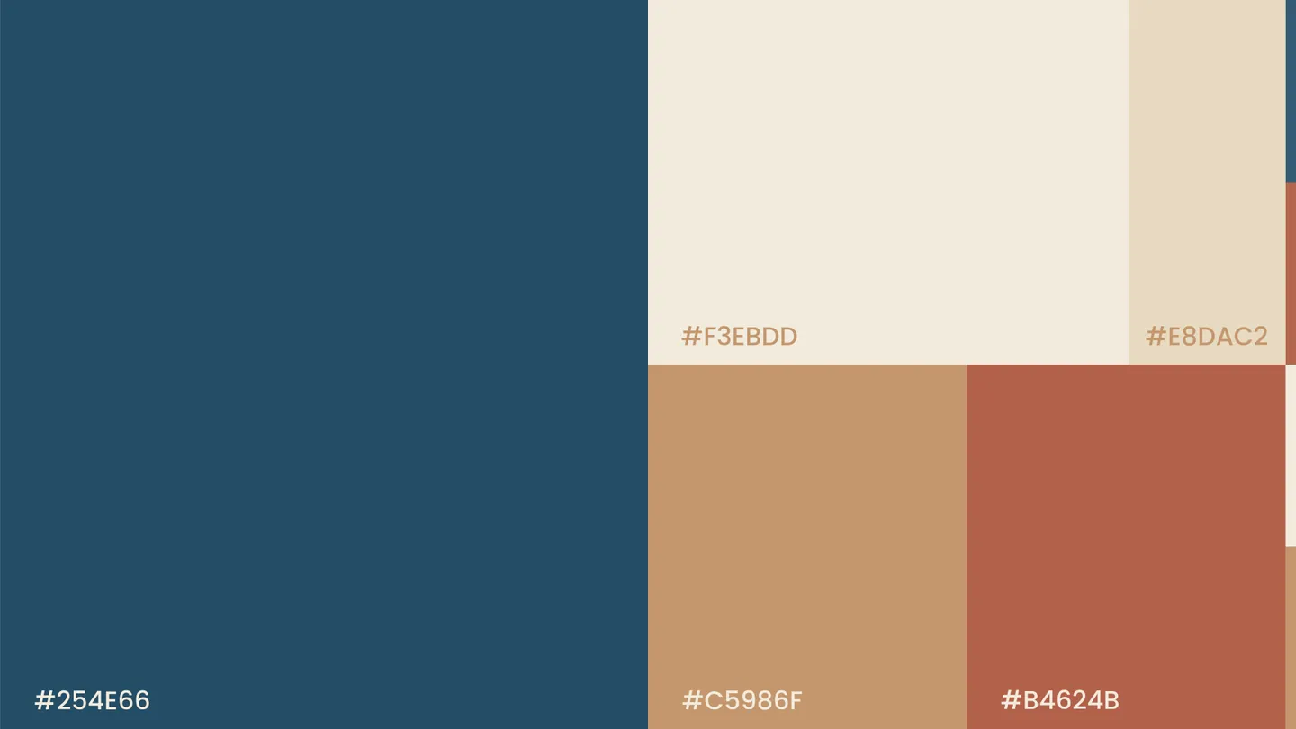
Palette

  • #254E66
  • #F3EBDD
  • #E8DAC2
  • #C5986F
  • #B4624B

Typography

Poppins

  • Brand concept
  • Logo and construction
  • Versions
  • Palette
  • Typography
  • Graphic pattern
  • Applications
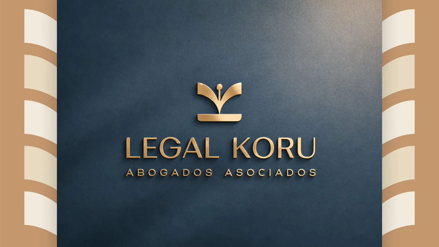
Legal Koru logo on blue

Plastic, aesthetic and reconstructive surgery

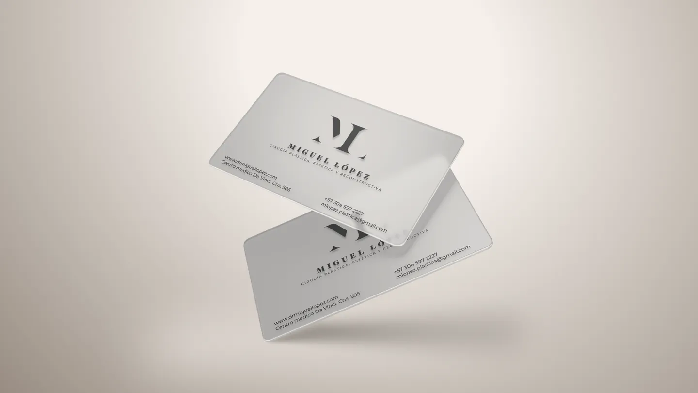
Dr. Miguel López

A brand worthy of the practice

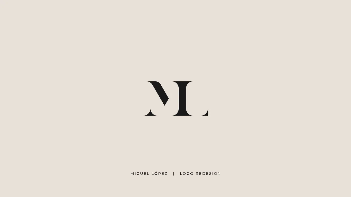
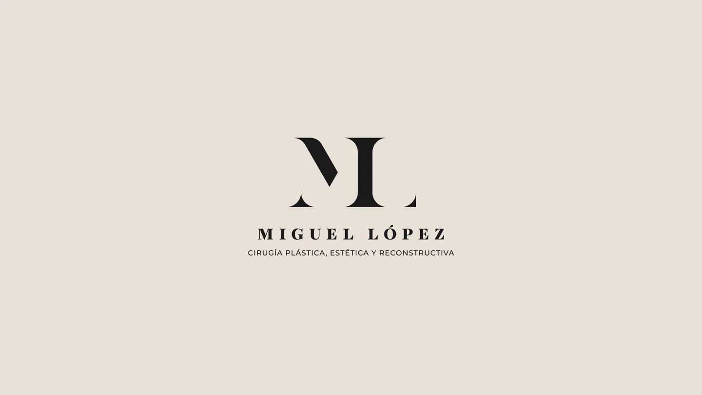
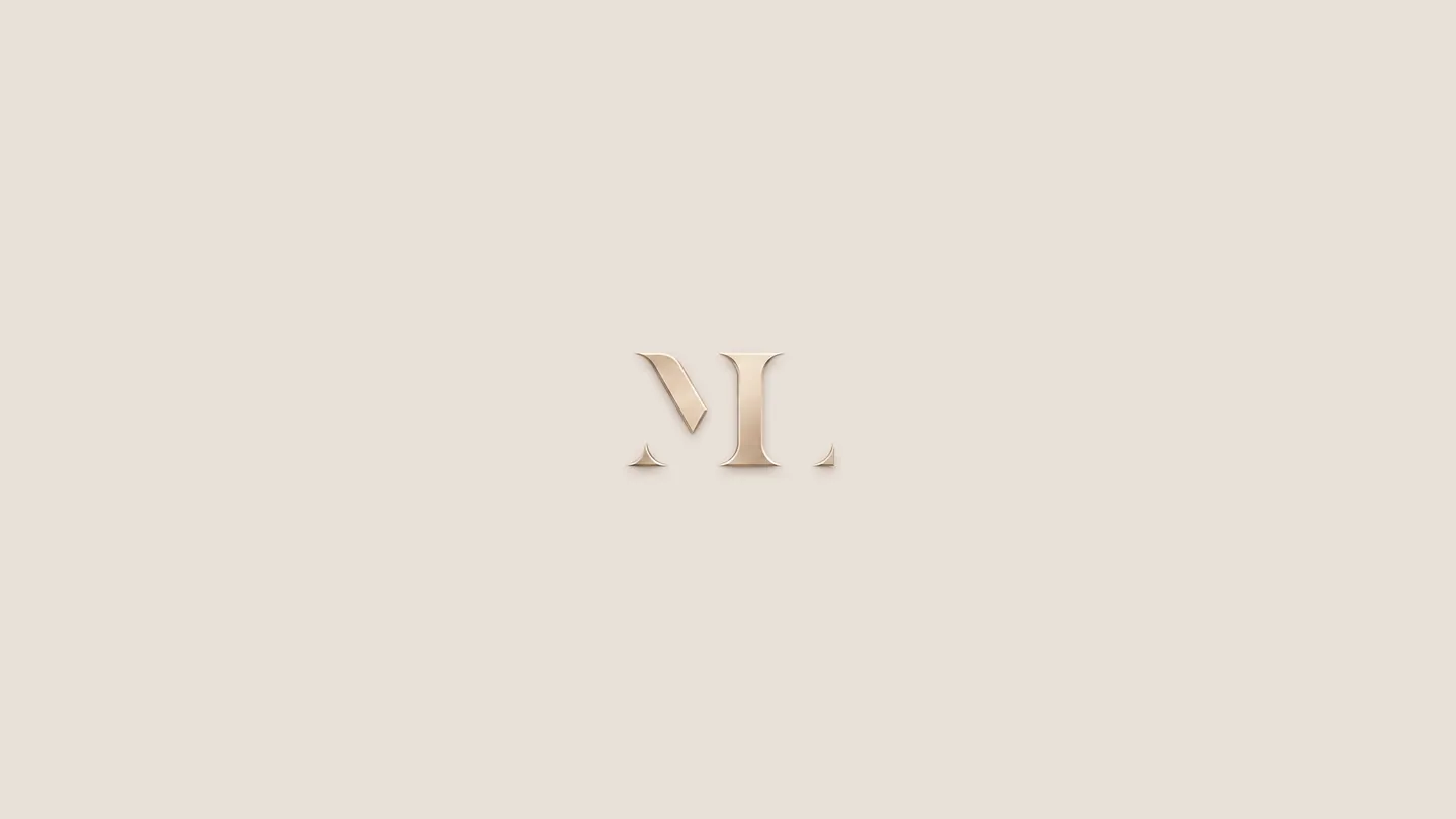
Identity redesign for a plastic surgeon: an ML monogram in a serif typeface, sober and elegant, that conveys precision and trust before the first appointment.

Read the full concept

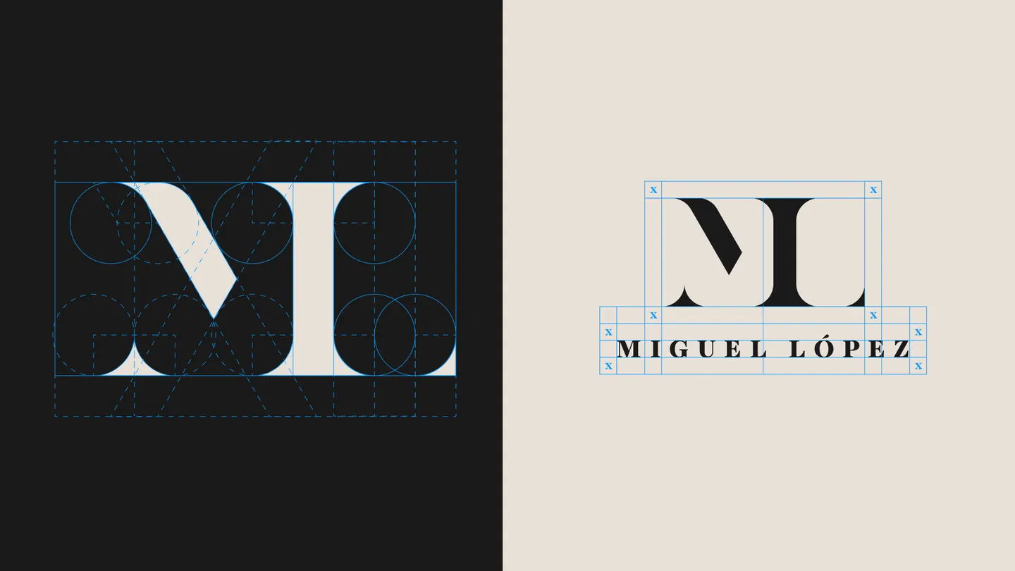
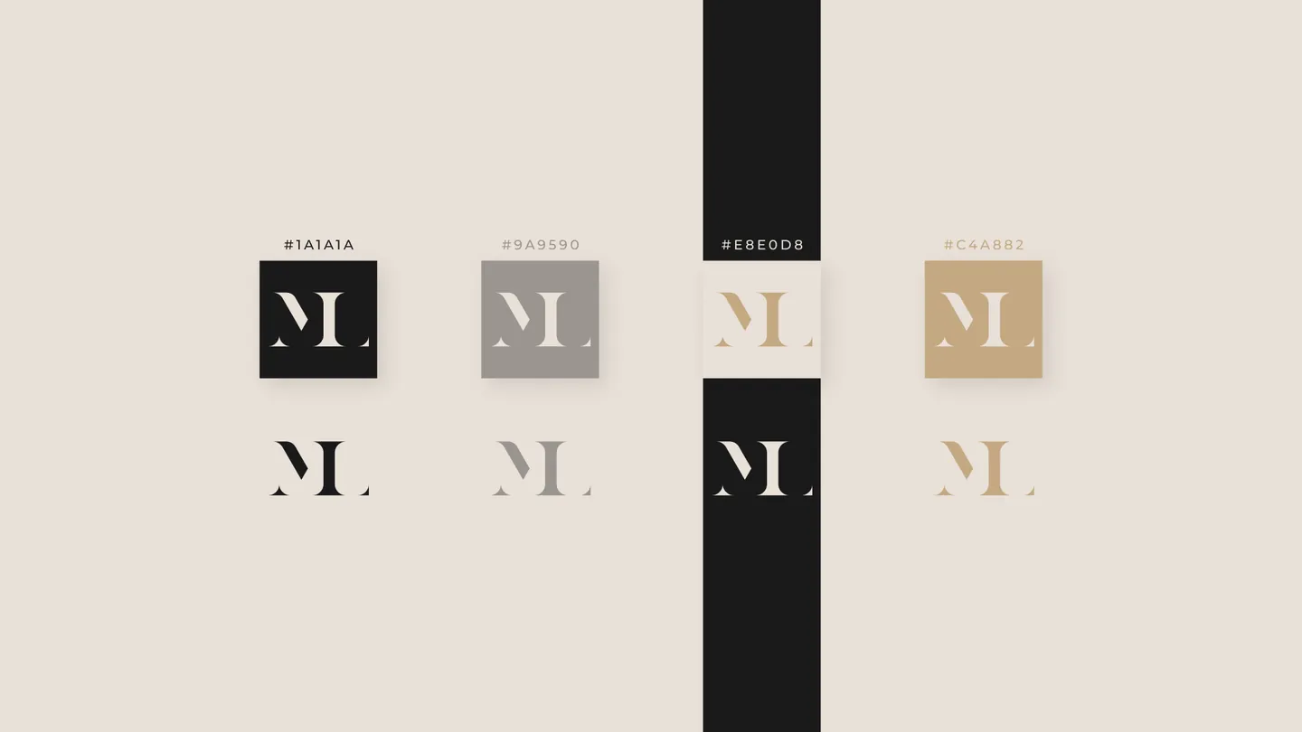
The system includes the monogram built on a grid, versions for every format, the type pairing, a neutral palette with a gold accent and its use on stationery and on the surgical scrubs, which we also designed.

Palette

  • #1A1A1A
  • #9A9590
  • #EBE0D8
  • #C4A882

Typography

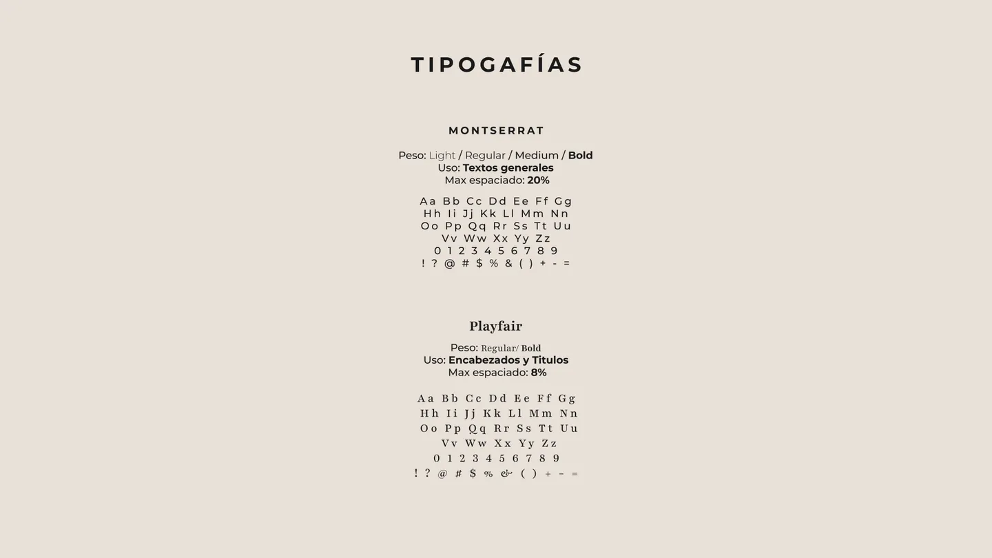
Playfair Display · Montserrat

  • Rebranding
  • Monogram and construction
  • Versions and minimum size
  • Typefaces
  • Palette
  • Stationery
  • Uniform design
ML monogram

Artist identity

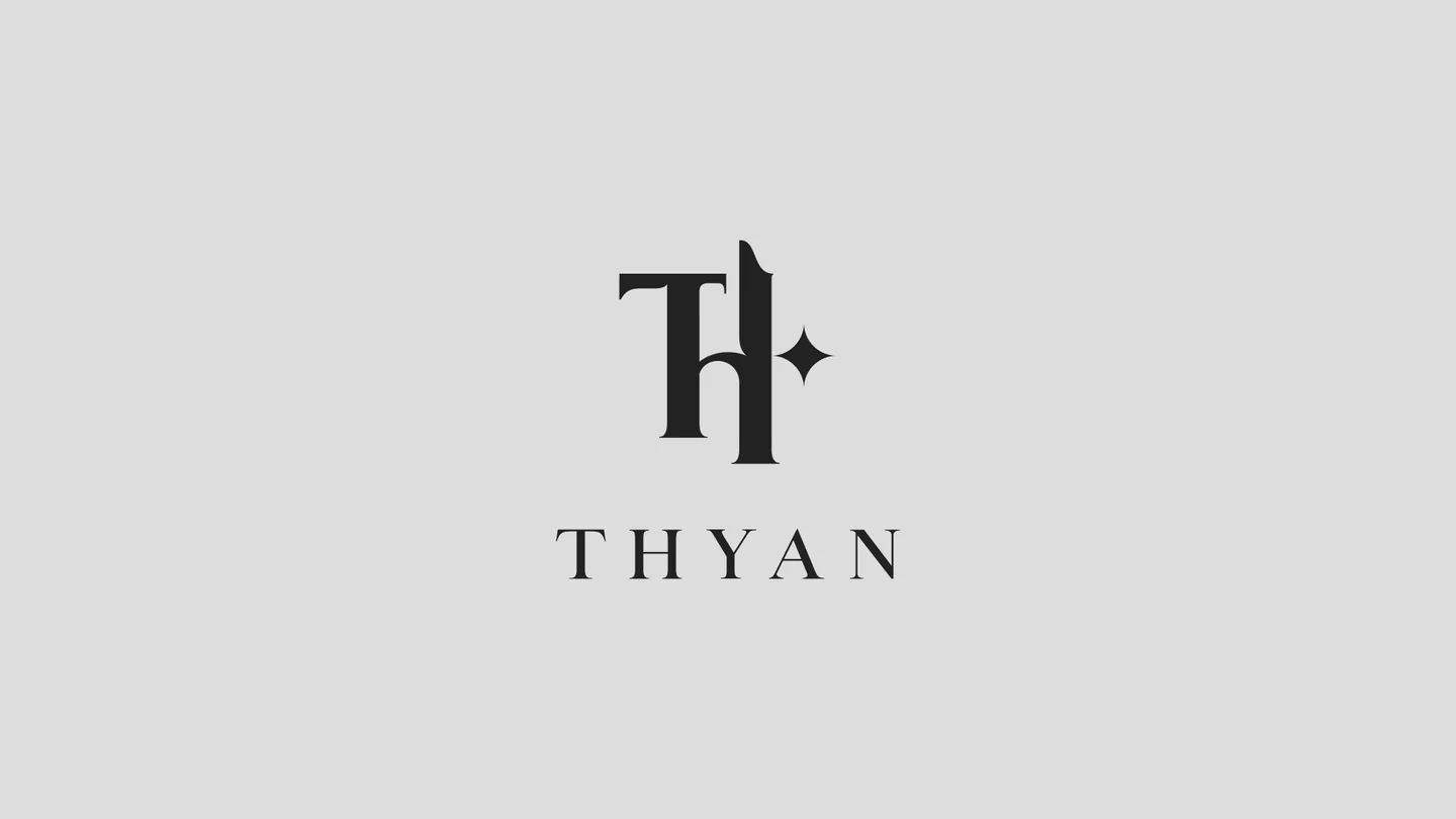
THYAN

Nonconformist elegance

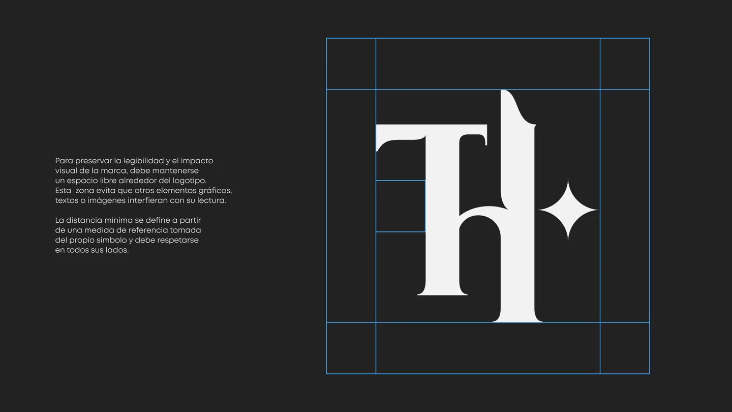
THYAN is a personal, artistic identity built on an idea of nonconformist elegance: a meeting point of sophistication, music, expression and restrained rebellion. The project aims to convey an authentic, bohemian personality without falling back on overly commercial, psychedelic or predictable visual codes.

Read the full concept

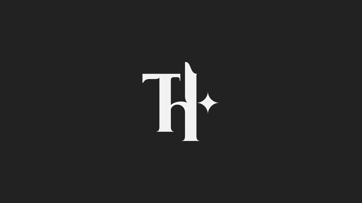
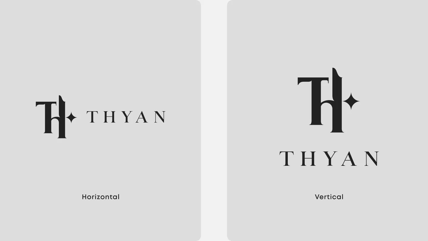
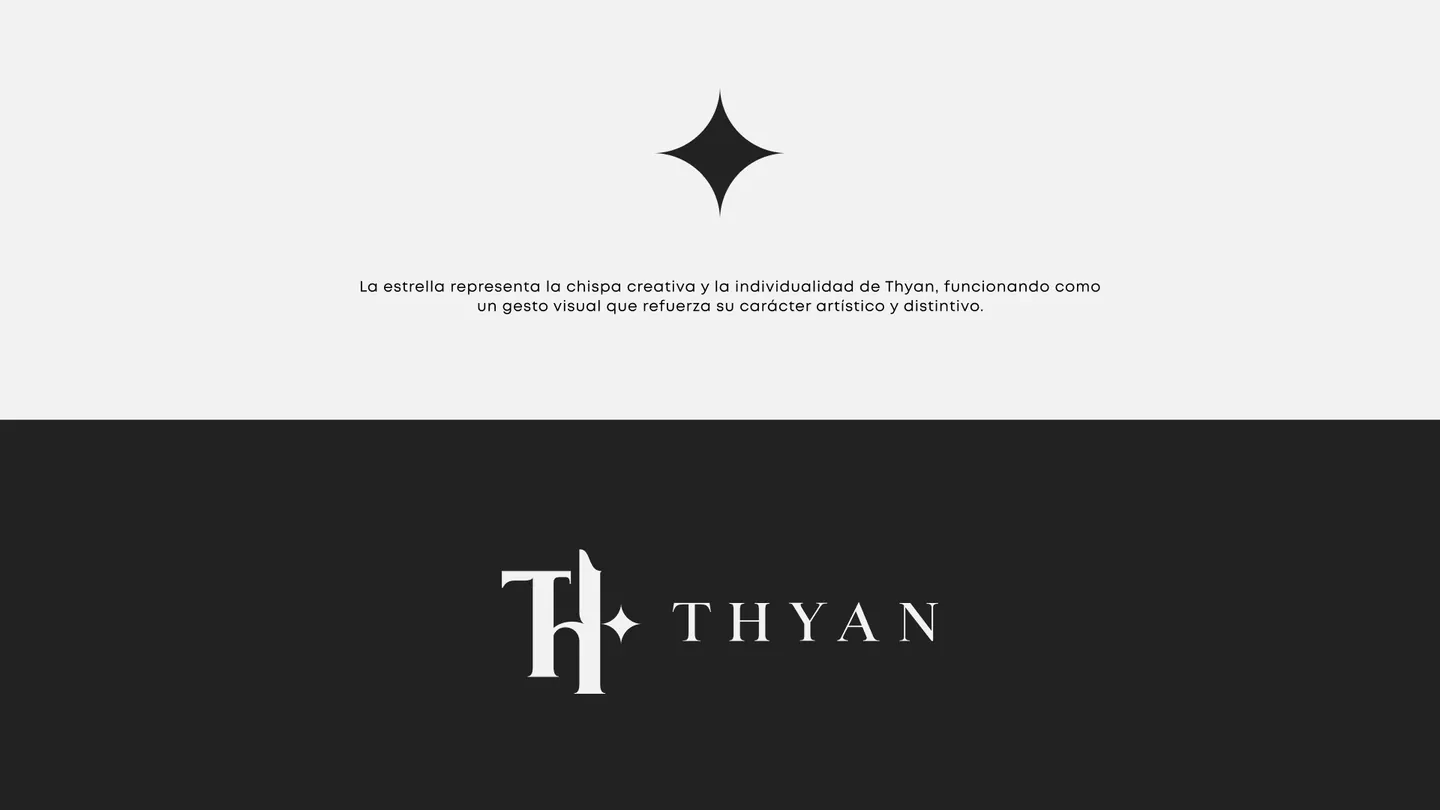
The identity develops around the concept of controlled strangeness, pairing an elegant custom typeface with interventions that subtly break its structure. The system is completed by a monogram built from the initials T + H, conceived as an author's mark that can stand on its own, and a gestural signature that adds spontaneity, freedom and a more human dimension to the brand. Small symbolic elements, like the star, represent THYAN's creative spark, individuality and presence.

The result is a flexible, recognizable visual system that balances precision and expression, letting the identity keep its character in editorial and digital applications as well as in pieces tied to music, fashion and visual culture.
Palette

  • #222222
  • #F2F2F2
  • #DDDDDD

Typography

Custom typeface

  • T+H monogram
  • Wordmark
  • Clear space
  • Versions
  • Graphic pattern
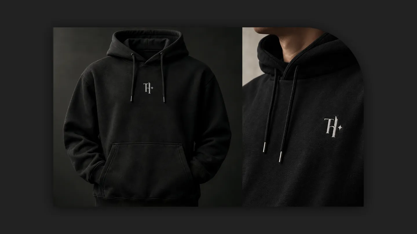
  • Apparel
TH monogram on a dark background

Toy brand

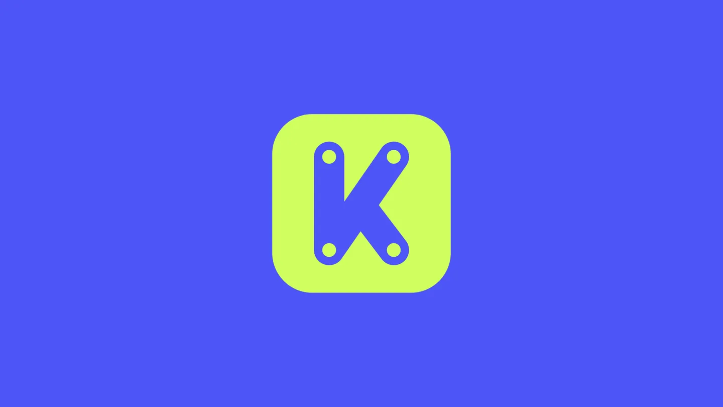
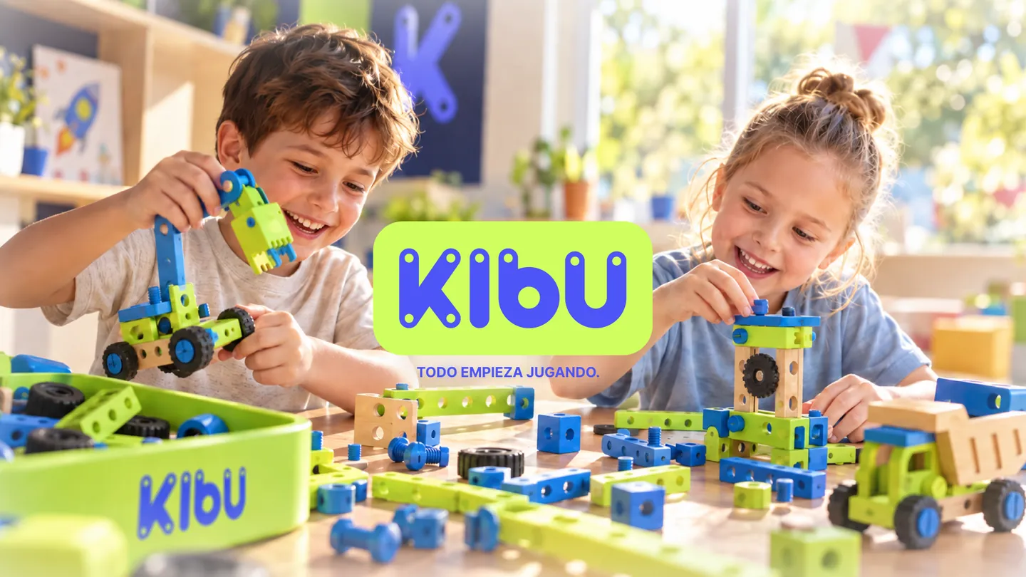
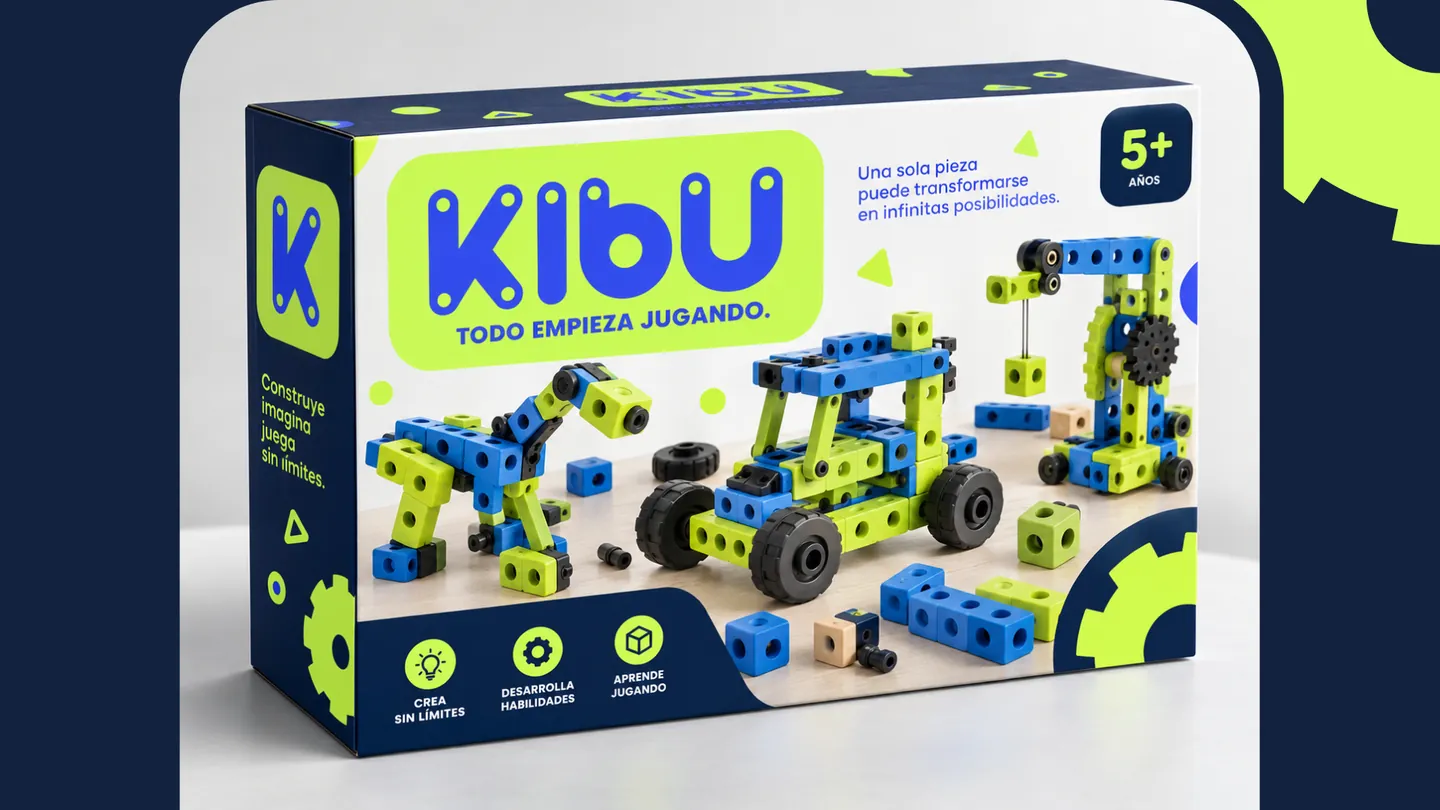
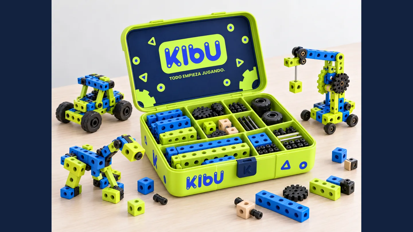
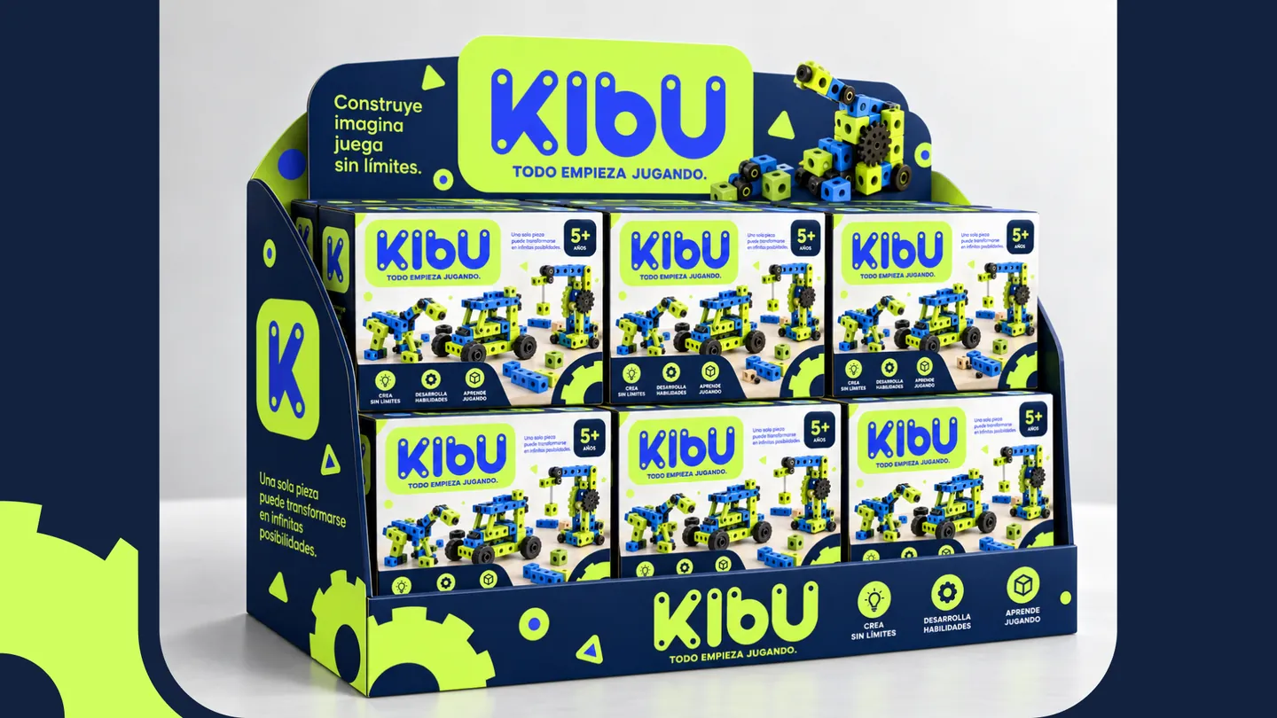
KIBU

It all starts with play.

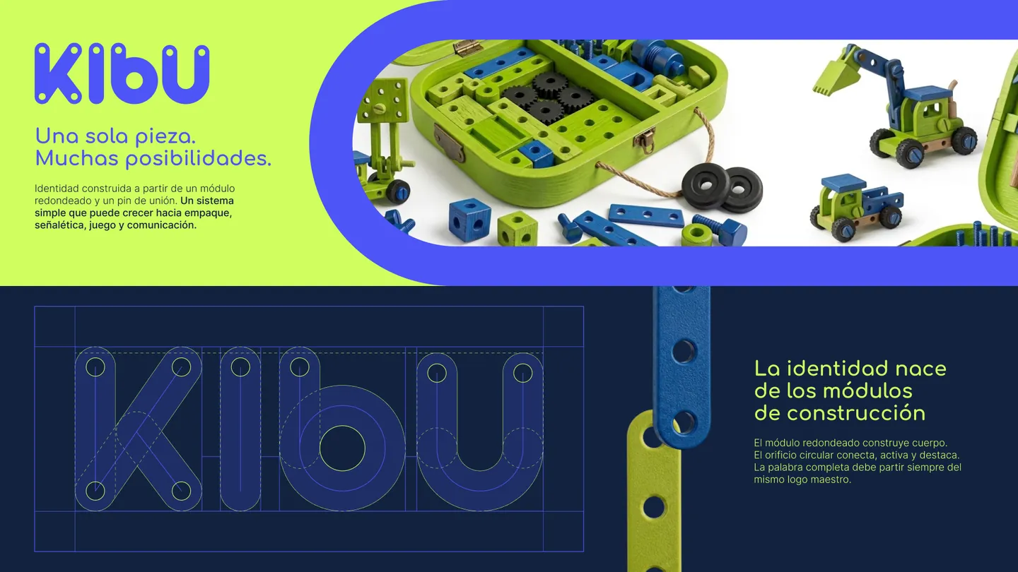
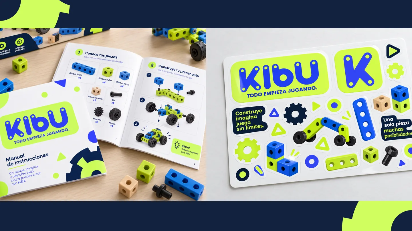
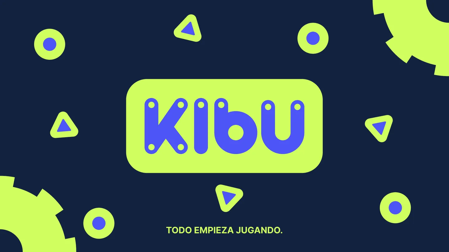
KIBU is a visual identity built around curiosity, play and children's creativity. The project sets out to represent a universe where exploring, imagining and experimenting are a natural part of learning, far from rigid or overly academic communication.

Read the full concept

The identity blends an energetic, friendly and contemporary aesthetic, using intense colors, strong contrasts and dynamic graphic resources to build compositions full of movement and personality. The art direction brings together photography, product, graphic shapes and playful elements to create a system that connects with children without losing clarity or brand consistency.

More than just a logo, KIBU unfolds as a flexible visual universe, designed to adapt to different touchpoints while always keeping a sense of discovery and fun. The result is a cheerful, recognizable identity that puts creativity at the center of the brand experience.

Palette

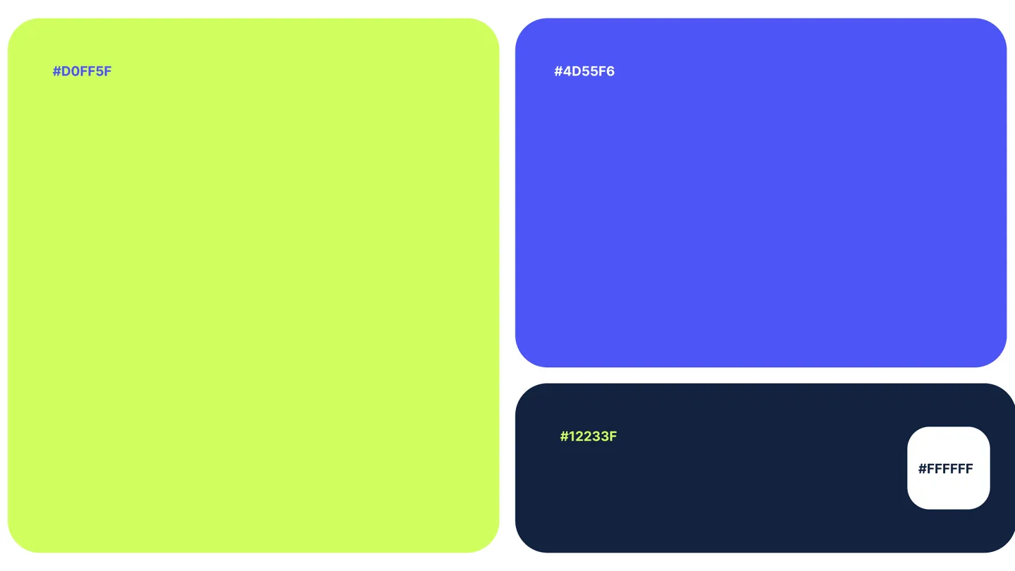
  • #D0FF5F
  • #4D55F6
  • #12233F
  • #FFFFFF
  • Modular logo
  • Construction
  • Palette
  • Packaging
  • Display stand
  • Instruction booklet
KIBU K symbol on blue

How we work

Four steps, one team from start to finish.

  1. Discover

    We understand your business, your goals and your audience before touching a single screen.

  2. Design

    We shape the idea: identity, interface and experience, focused on what drives results.

  3. Build

    We produce the brand, pages, pieces and campaigns in short cycles, with reviews alongside you.
  4. Launch

    We publish, measure and support your growth. Launch is the beginning, not the end.

ACE · Content and campaigns

Pages already working for our clients.
  • Brand + website

    Dr. Miguel López · Full rebrand and digital presence

    Logo, visual system, stationery and brand guide for his practice, and a website that builds trust before the first appointment.
    Visit site ↗
  • Website

    Alejandra Alfaro · Portfolio for a content creator

    A site with animations and cinematic scrolling that presents her work the way she tells it on social media.

  • Landing page

    TED COMPANY · Landing page for a media agency

    A page that presents the agency to brands and artists with the strength of the network it runs.

    Visit site ↗
  • 3D website

    Sebastián Ramos · Immersive architecture portfolio

    3D scenes and immersive navigation between projects so architecture can be walked through, not just looked at.

  • Online store

    Michell Arango · E-commerce for a skincare brand

    Catalog, cart, online payment with Bold, shipping by zone across Colombia and a notification for every order. The brand manages its products from its own dashboard.

Case studies

Contact

Let's talk about your project

Tell us what you need and we will get back to you with a clear proposal.

Reach out

Use whichever channel you prefer. We reply with a clear proposal.

Working in Colombia, Chile and Canada

Send us a message

We'll reply to the email you leave us.

What do you need?